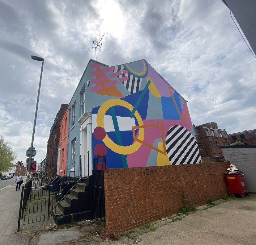
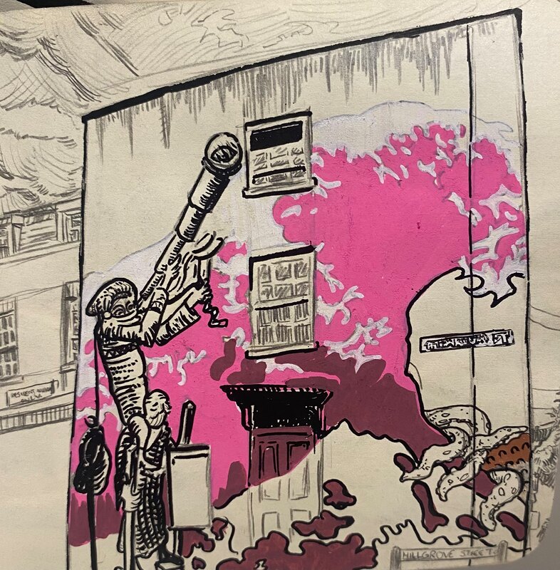
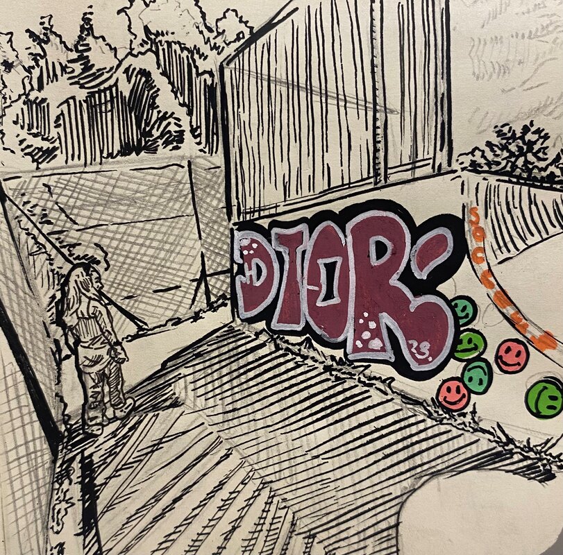
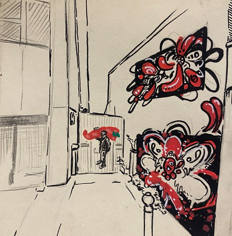
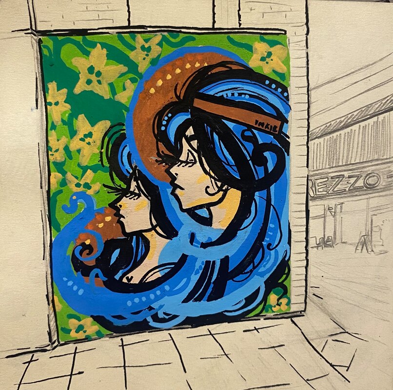
Project proposal and Final work- Bailey GardnerPeople often describe large cities or built up areas with urban, modern buildings as concrete jungles, usually used in a negative context to express the distaste in the inorganic, cold and intimidating monoliths that surround us. However, I don't feel that this is a fair description to most cities; Jungles are known for the biodiversity, vibrancy and colours and if a city can be described as a concrete jungle then diversity, vibrancy and colour can also be found there. While not in the same way as in actual jungles, we can look towards the creativity and art dwelling inside. After living in the heart of Bristol for the past year, I have been made acutely aware of the city's love for creativity and expression. On almost every building you can see graffiti, murals or small slaps and tags. Not only do they serve as an expression for any artist (notably Banksy, having been born here) but they also add a vibrant character to the city itself; weather its shop shutters, the sides of houses or plain old walls art can be found so easily. In my project, titled Concrete Jungle, I want to explore Bristol and take note of both the recognised and "underground" graffiti via illustrations and photographs in order to highlight its relevance in its ability to inspire and display in the city. 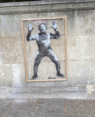 Banksy, B. (2022), Spree Banksy [stencil]. At Bristol Queen's Road.In addition, I also aim to compare and contrast graffiti between different cities, namely Gloucester and Cheltenham. Having grown up in Gloucester I have seen a lot of the art there but I'd rather use this opportunity to explore and delve deep into my home's underbelly to uncover works that have gone unnoticed. As for Cheltenham, I don't know the city as well, yet it offers a great opportunity for exploration and resource gathering as the annual Cheltenham paint festival leaves beautiful works of art in its wake and the few I have seen are definitely worth sharing. Plan: 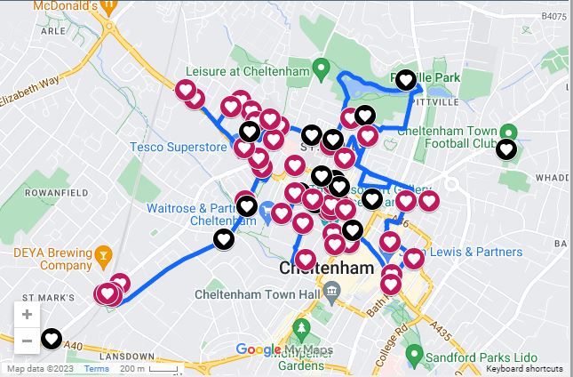 Andy 'Dice' Davies (2022) Festival Map [online]. Google maps. Available from: https://www.cheltenhampaintfestival.co.uk/2020map [Accessed 01 May 2023]In terms of materials, for photographs I will simply use my iPhone in order to avoid the risk of carrying a borrowed camera while travelling all over the county, not only are the pictures of decent quality, they have the location and date attached to the image for my own future reference which could be useful. For the illustration side of the project, I will use Posca pens, black ink fine liners, a mechanical pencil and a small a6 moleskin sketchbook. The black ink/ pencil will be used to draw the buildings and backgrounds While the vibrant colourful Posca pens will be used to recreate the graffiti or murals painted onto said buildings and backgrounds. This will create a stark contrast between the building and the art, almost separating them between their perceived qualities. One aspect of the drawings/ sketches is dull and monotone while the other aspect (graffiti) has the opportunity to be vivid and eye catching. This method of manipulation through illustration is to create more of a focus on the art over the architecture in order to highlight the effect of the work on me personally and to showcase perhaps unnoticed or disregarded work by potential viewers. Photographs from each city:
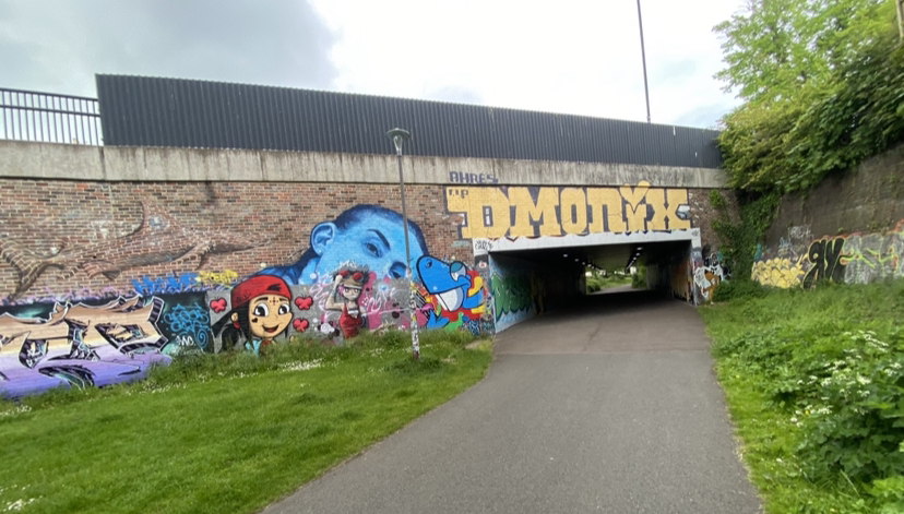
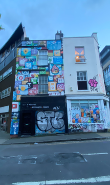
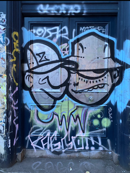
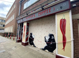
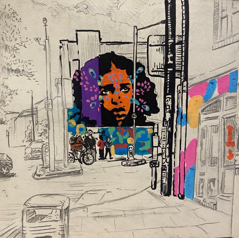
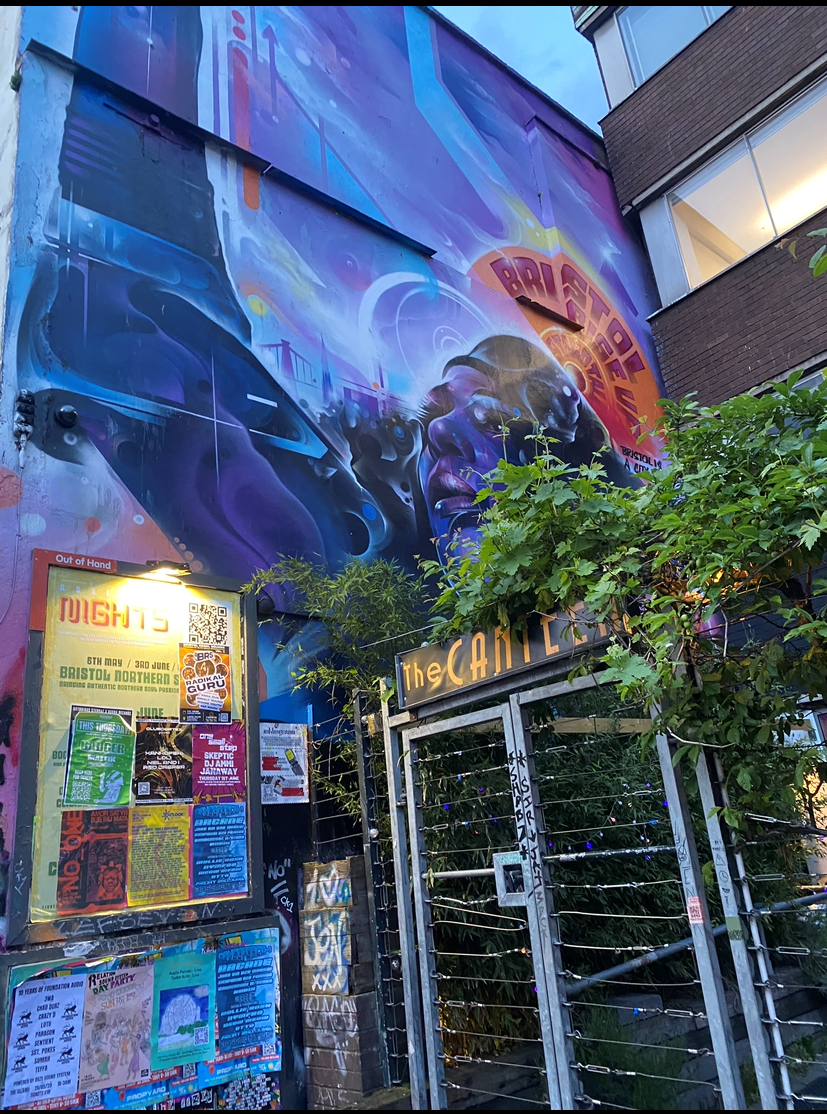 (3 murals found on Gloucester Road in Bristol- each a different form of expression providing a varied impact, from simple line cartoons to reflections of media to identity and politics/ values. Each instalment helps to paint an image of Bristol)Gloucester:
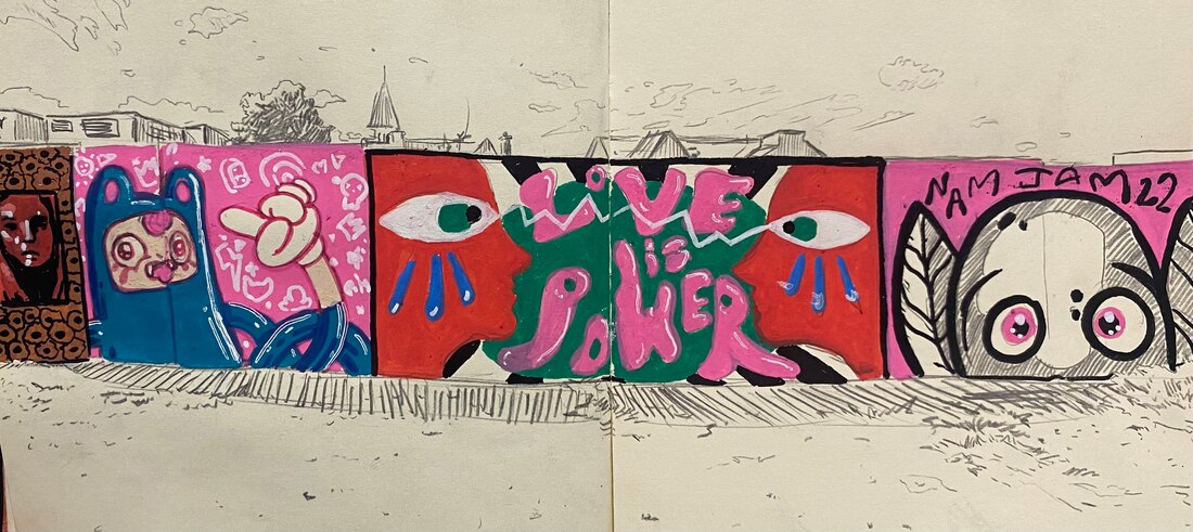
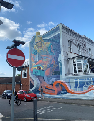
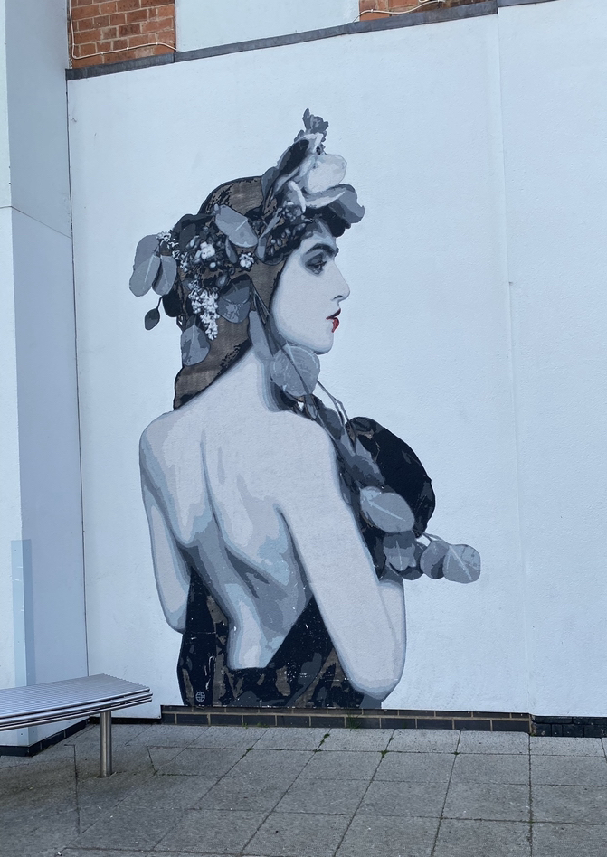
 Cheltenham is covered in these beautiful murals, they're practically inescapable, from the moment you set foot outside of the train station there are murals in every direction- each brought to life through the paint festival. All of the works are grandiose and detailed and can be found in very public places, ruling out the idea that most of the art could be illegal graffiti, but it also represents the sense of community Cheltenham has for its artists and those who appreciate their works. Illustrations: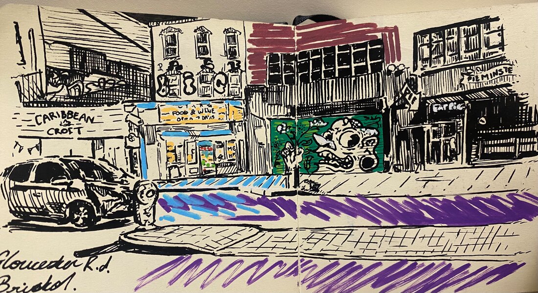
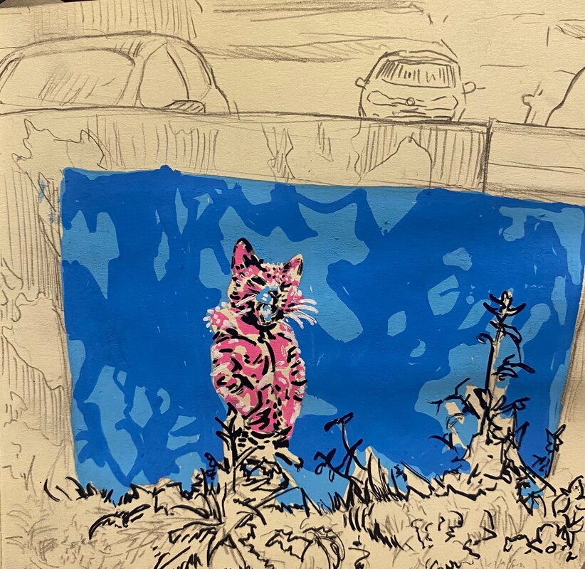  While collecting photos and documenting the murals into a sketchbook, friends often told me that they didn't take much notice to the graffiti around their city; I believe this style of colouring is highly effective in pulling attention. While the idea is simple, its effect and overall aesthetic is profound and has succeeded in terms of my goals for the illustrations in the project. While i would love to share more illustrations from the project. most of my collection of images are in photograph format- I only decided to draw the murals that caught my attention and that I deemed significant. However anyone can choose to find significance in murals and graffiti, therefore my photographs serve only as a possible extension to the project (perhaps through collaboration or photo editing). Another interesting idea for the illustrations would be to erase all of the pencil markings- leaving behind the murals and artwork exclusively- it retains the form of the building/ wall by following its 3D form however the buildings and backgrounds themselves are only suggested father deepening the focus on the art. One slight issue with this idea is that the locations of the murals may become harder to decipher as graffiti and murals aren't the only forms of landmarks that may cause a viewer to recognise, relate and connect to the art thus missing out on extra detail to flesh out the illustration. In addition, how can the character of a city be represented if the city itself is only suggested and not at least sketched. With careful consideration, I decided to keep the sketches of the cities and backgrounds in the drawings while refraining from overloading the works with detail and colour where it wasn't needed. The Photographs themselves can be found via this link to a google doc: https://docs.google.com/presentation/d/13RbEJmIZNqmc0TXiaSj2W3naiDgCShPoj4QDtCPbLpk/edit?usp=sharing Unfortunately there is a disparity between the cities, in terms of presentation, Cheltenham seems as if it has more to offer however, my work from the other two cities relied on live drawings on location as opposed to photographs in order to fulfil the 'reportage' style that the module was based on. However due to unfortunate circumstances, the original sketchbook was lost (likely on a train) along with a large portion of my documented work. Yet i feel the photographs provide the ability to display the marvellous works in each city. Although editing them to be reminiscent of the style of illustration could be an interesting route to go down in future. Conclusion/ Evaluation:Murals and graffiti represent the individual artists and their capabilities; yet those artists represent their story, identity and reflections in their work. Every city houses artists with a story to tell and something to add to the empty walls of these concrete jungles and the individuality and unique nature of murals and graffiti successfully inject and express character in a city. While some works are more effective than others, each piece is paramount in documenting the human touch and experience in an otherwise cold, inorganic environment.
In terms of how well I believe I have executed this project, there are many things I'd like to change. For starters, losing my initial sketchbook was a heavy blow to my work so documenting physical pieces digitally and creating backups would be a great solution. In addition, more photo manipulation could potentially boost the experimental aspects of this project along with perhaps collaborative opportunities via asking others to document the graffiti they see on their walks/commutes to work or anywhere for that matter. Finally, I feel I didn't research enough artists involved in graffiti, I wanted to document the raw upfront nature of the medium however by ignoring the works and words of many graffiti and mural artists, i feel I may have missed opportunities in developing this body of work further. However, many of the works I discovered on my explorations were untagged and hard to trace back to original artists but I wanted to focus on the character of the city- not the intentions of individual artists.
0 Comments
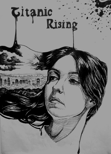
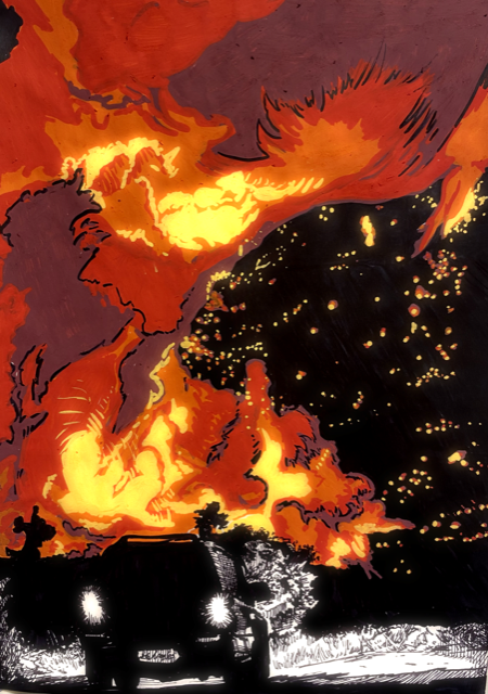
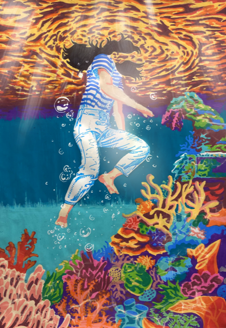
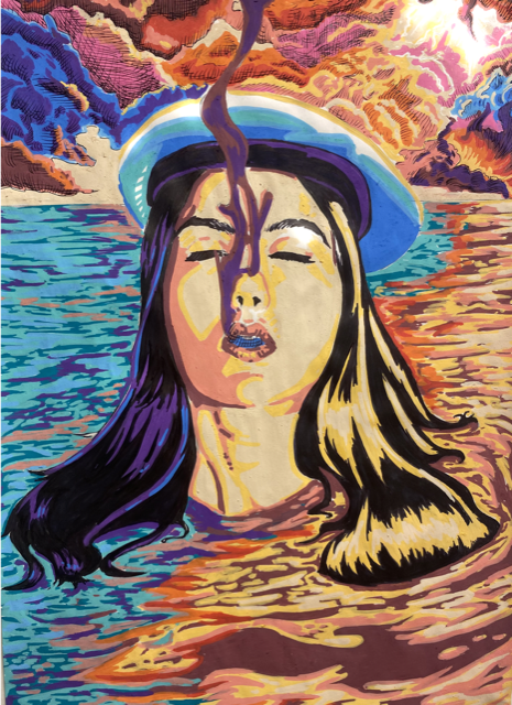
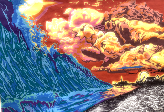
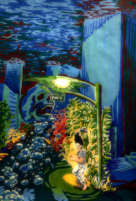
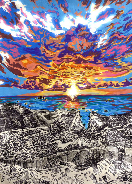
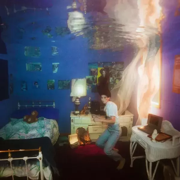
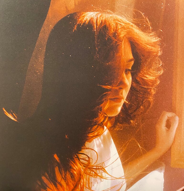
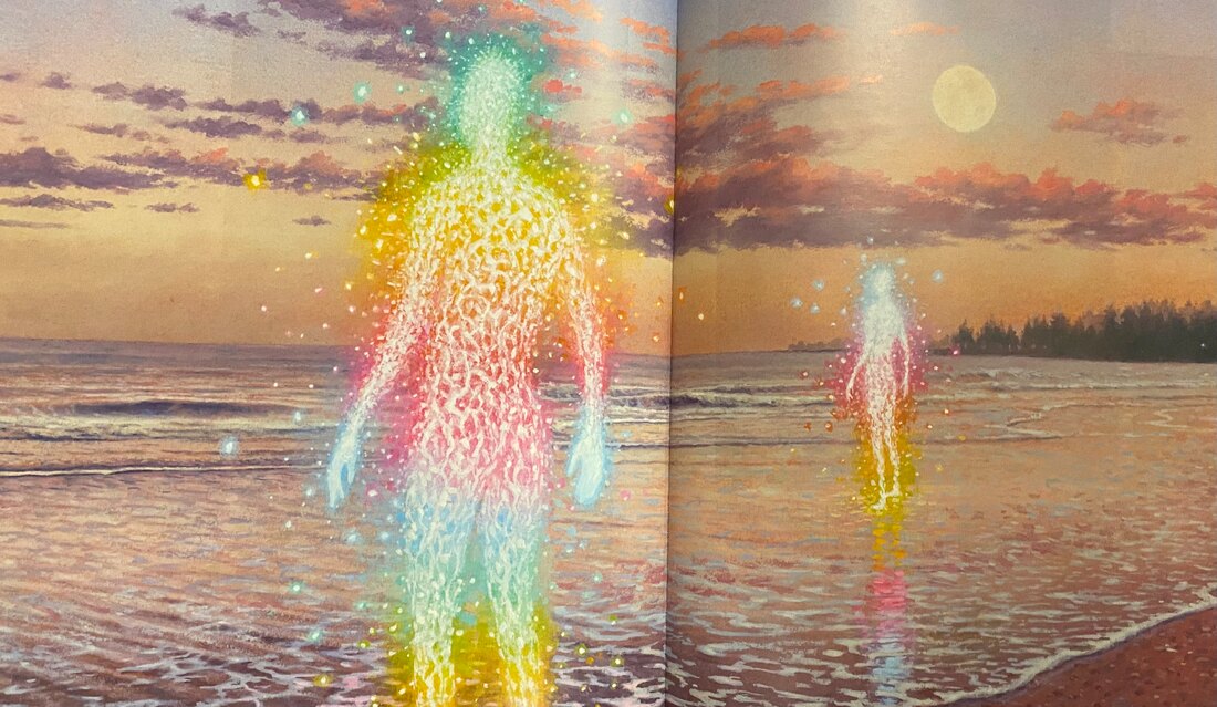
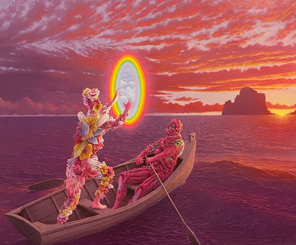
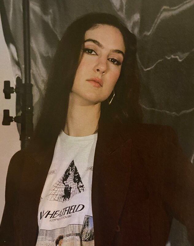
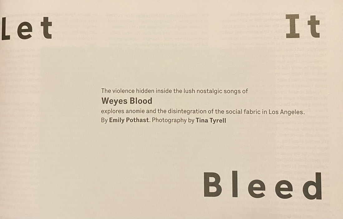
Initially, I wanted to create a parody/ pseudo magazine cover promoting art and artists. However after a playful trial sketch, I soon relalised this idea was almost too reliant on its conceptual idea as opposed to meeting the criteria of the project at hand. With that thought, the project was scrapped and I decided on producing a series of images inspired by Weyes Blood's "Titanic Rising" Album and interview featured in WIRE magazine.  Concept magazine cover: - not to be taken too seriously but the cross hatching was a style choice that I wanted to bring forwards into my final illustrations. Project planning:In terms of preparation and plans, I created mood boards and brainstorm pages to aid me in visualising the illustrations. From the interview, I had decided that my main focuses would be LA and Global warming. I also wanted to focus on the ocean, mainly because the album explores ideas of morality revolving around climate change while being backed with instrumentals that sound as if they belong in SpongeBob. Jokes on my maturity aside, this sonic inspiration led me to try and include some SpongeBob esque scenery in underwater illustrations.  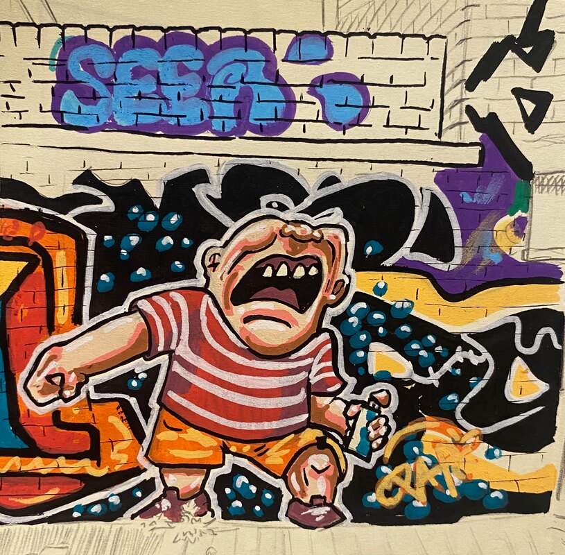 Many ideas here were scrapped, which is to be expected as they were only rough ideas however some of the most important elements that I wanted to develop were; - LA on fire : reflecting the California wildfires and mentioned in the interview, reflects the idea of living with suffering and having an almost apocalyptic backdrop to an otherwise vibrant or uplifting medium. - Digital editing: I decided on using posca paint markers and fine liners for traditional illustrations but some lighting effects are difficult to create with said mediums. Thus digital editing can compliment the work if necessary. -AI art generator for reference and inspiration: This was quite helpful as I was able to have images with my intended style and setting at my fingertips to use for interesting lighting reference or tonal reference in the emotion I'm trying to convey. 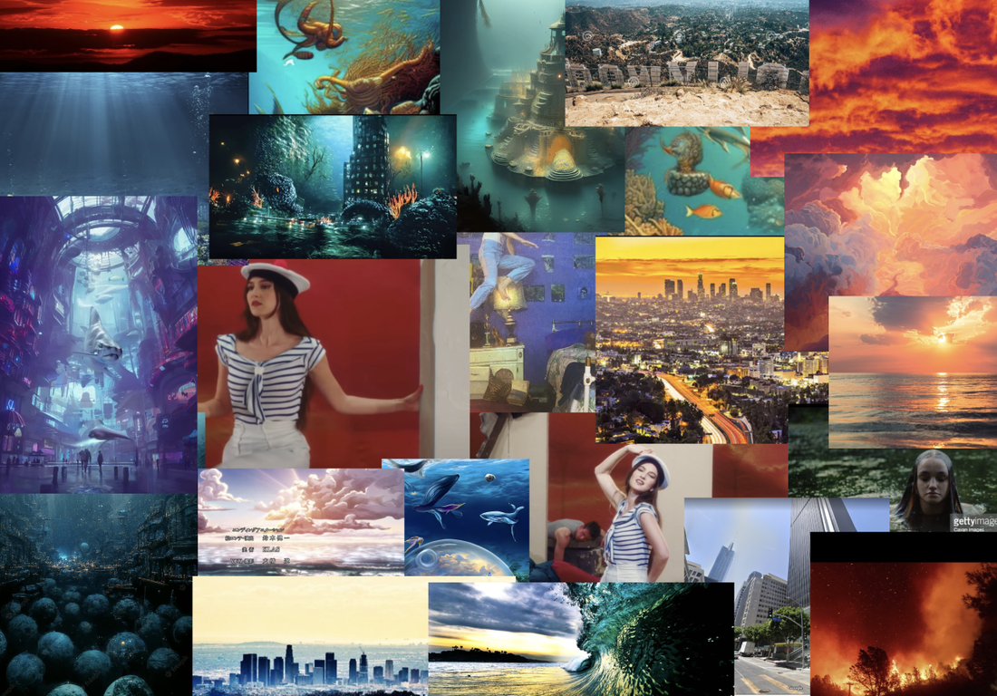 I used Google maps to procure images of LA with erspectives I desired using the zooming tool on Google maps- a very helpful feature. Series of Images: |
AuthorArchivesCategories |

 RSS Feed
